Render text using these panels. Explore numerous tags for formatting custom parts of your text. In this article, you will find the following information:
- Font usage optimization and troubleshooting
- WYSIWYG editor: Tips and Tools
- Text properties
- Text panels: Rich text tags
Font usage optimization and troubleshooting
Here’s some valuable information to ensure optimal font utilization and troubleshoot display problems:
1. Leveraging system fonts
Utilize all the fonts available in your system to diversify your design options. Alternatively, for enhanced portability, consider copying the .ttf / .otf files to the /assets/fonts/ folder within your project.
Pro Tip: After installing new fonts, remember to reload the project to ensure smooth integration.
2. Troubleshooting font display
Encountering squares (“□□□□”) instead of text in your panels? This often indicates that the selected font lacks glyphs for the language characters you’re trying to display. To address this issue:
- Choose a compatible font: Opt for a font known to support the range of characters you require. For instance, the built-in Noto Sans font covers a wide variety of languages, ensuring comprehensive character support.
Remember, the accurate display of language-specific characters is pivotal for effective communication in your designs.
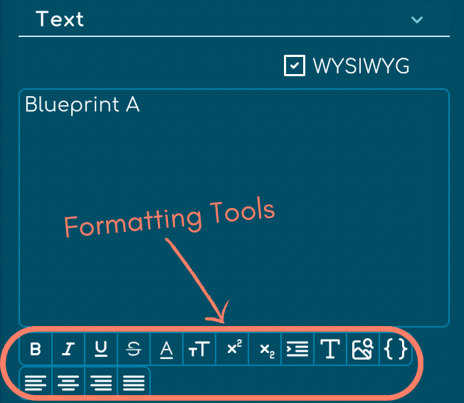
WYSIWYG editor: Tips and Tools
Here are some valuable tips and tools to help you make the most of it:
1. Adjusting text readability
Encountering difficulties with input text readability? Whether it’s text appearing too large, small, or experiencing color issues, you can easily troubleshoot by toggling the WYSIWYG editor. Simply check the checkbox to reveal all formatting tags, providing better visibility and control over text formatting.

Pro tip: Disable the WYSIWYG checkbox to remove all formatting tags swiftly using the “Remove tags” button.

2. Utilizing formatting tools
Harness the power of formatting buttons within the WYSIWYG editor to customize your text effortlessly. From setting text attributes like bold, italic, underline, strikethrough, to adjusting color, size, superscript, subscript, indentation, font, icon, variable and alignment.
Text properties
The editor offers a comprehensive set of formatting tools, allowing you to customize your text to fit your design needs:
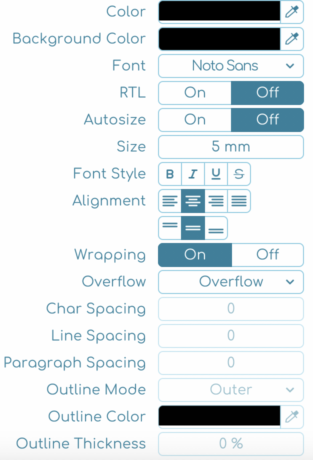
- Color: Select the color of your text.
- Background Color: Choose a background color that applies to the entire text panel, not just the text, to create a distinct block of color or to contrast with the page background.
- Font: Choose a variety of fonts for your text. The dropdown is organized into several sections for ease of access:
- The five most recently selected fonts for quick reference.
- Fonts used elsewhere in your project to maintain consistency.
- Custom fonts added to the /assets/fonts/ directory for personalized styling.
- Available system fonts that offer a broad selection.
- Note: The list of recent and project-used fonts updates automatically. Remember to reload your project after adding new system fonts or copying fonts to the project folder to see them in the dropdown.
- RTL (Right-To-Left): Switch on for languages/fonts that flow from right to left. Set text alignment to right and choose a compatible font to ensure proper character and ligature display. Be aware that certain languages or fonts may affect typography ligatures in RTL.
- Autosize: Automatically adjust the text to fit within the panel dimensions.
- Min and Max Size: Set the smallest and largest sizes for your text.
- Font Style: Apply bold, italic, underline, or strikethrough styles to enhance text emphasis.
- Alignment: Align your text to the left, center, right, or justify it within the panel.
- Wrapping: Control how text wraps and handles overflow within the panel.
- Overflow: Manage how text that exceeds the panel size is handled, with options like overflow, ellipsis, or truncate to ensure a clean and readable appearance.
- Char and Line Spacing: Fine-tune the space between characters and lines for better readability.
- Paragraph Spacing: Manage the spacing between paragraphs to structure your text clearly.
- Outline Color: Add a distinct color outline to your text.
- Outline Mode: Choose the mode for the text outline, with options like Outer, Centered, or Inner.
- Outline Thickness: Determine the thickness of the text outline for visual emphasis. The outline size ranges between 0 and 100% relative to the font size.
Text panels: Rich text tags
Text panels in Tabletop Creator support a variety of rich text tags, allowing you to customize the styling and appearance of your text. When editing rich text tags, disable the WYSIWYG editor to make manual adjustments.
There are tags that support additional values; if they are numeric, you can use percentages like 80% -20% or in discrete values like 20 -35 0.5.
Remember to close a tag with this format: </TAG_NAME> (for example: </b>, </align>, </font>).
Here’s a comprehensive list of supported tags:
| Tag | Description |
|---|---|
| <b> | Apply bold styling. |
| <i> | Apply italic styling. |
| <u> | Apply underline styling. |
| <s> | Apply strikethrough styling. |
| <color=#RRGGBB> | Change the text color. |
| <color=#RRGGBBAA> | Change the text color. |
| <alpha=#AA> | Change the text alpha color. |
| <mark=#RRGGBBAA> | Add an overlay to highlight text. |
| <size=75%> | Adjust the font size. |
| <sup> | Apply superscript styling. |
| <sub> | Apply subscript styling. |
| <indent=15%> | Control horizontal caret position across lines; use with left alignment. |
| <line-indent=20%> | Insert horizontal space after it and before new lines. |
| <align=”left”> | Change text alignment to left. |
| <align=”center”> | Change text alignment to center. |
| <align=”right”> | Change text alignment to right. |
| <align=”justified”> | Change text alignment to justified. |
| <cspace=80%> | Adjust character spacing. |
| <mspace=15> | Set monospace character spacing. |
| <space=30> | Insert a horizontal offset. |
| <margin=10> | Adjust horizontal margins. |
| <margin-left=10> | Adjust left horizontal margin. |
| <margin-right=10> | Adjust right horizontal margin. |
| <width=50%> | Adjust horizontal size of text area, limited by panel size. |
| <pos=45%> | Control horizontal caret position for one line. |
| <line-height=120%> | Adjust line height; use with <voffset=30> to avoid auto-adjust for displaced text. |
| <voffset=30> | Apply vertical offset to text; line height adjusts automatically. |
| <font=”Arial”> | Switch fonts; embed icons from vector icon fonts. |
| <lowercase> | Alter capitalization to lowercase. |
| <uppercase> | Alter capitalization to uppercase. |
| <smallcaps> | Decrease size of non-uppercase characters; appears like uppercase. |
| <nobr> | Prevent text separation by word wrapping. |
| <noparse> | Ignore rich text tags within enclosed text. |
| <unicode> | Render unicode characters without actual characters. Use with <font> for icons. Example: <unicode>2665</unicode> → ♥ (U+2665 BLACK HEART SUIT). |
| <nbsp> | Provides a space that will not be affected by word wrapping, providing a space that won’t be affected by word breaks. |
| <zwsp> | Represents a zero-width space, useful for separating words or characters without adding visible space on the page. |
| <br> | Indicates a line break. Used to break a line of text and start on a new line. |
| <i angle=#></i> | Allows rotating the text within it by a specified angle, specified by the # value in degrees, using a style-like tag format. |
| <rotate=#></rotate> | Allows rotating the text within it by a specified angle, specified by the # value in degrees, using a specific rotation tag. |
| <allcaps> | Converts all text contained within it to uppercase, regardless of its original case. |